Google search Ads Entwicklung/Google search ads evolution
29 abril, 2014 Deja un comentario
Letzten Monat hat Google verändert, wie bezahlte Werbeflächen auf der Suchresultseite gezeigt werden. Früher wurden bezahlte Werbeflächen farbig unterlegt rechts oben auf der Resultatseite gezeigt. Mittlerweile haben sich die Augen der User zu sehr an die farbigen Werbeflächen gewohnt und gelernt sie zu vermeiden. Die Leute filtern die farbigen Inhalte aus ihrer Wahrnehmung, weil sie schon wissen dass es sich um Ads handelt
Mit dem Ziel mehr Sichtbarkeit für die Adwordskunden zu erzielen, hat Google den sichtbaren Unterschied zwischen organischen Suchergebnissen und Ads stark reduziert. Jetzt trennt nur noch eine eine feine, graue Linie die jetzt weiss unterlegten Ads vom Rest der Seite. Damit sie vermeiden sie die sog. “Banner blindness” , ein Phenomen das in den heat maps von Nielsen gut belegt ist.

Google Testteams studieren die Aufmerksamkeitsökomischen Verhaltensweisen ihrer User und analysieren die Effektivität der Werbeflächen in Bezug auf ihr Format. Also ist das Phenomen ständiger Änderungen kein Zufall. Das vor allem weil die bezahlten Werbeflächen bzw. die Adwords Sektion ihrer Website einen Grossteil von Google’s Umsatz ausmacht.
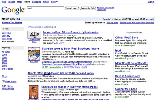
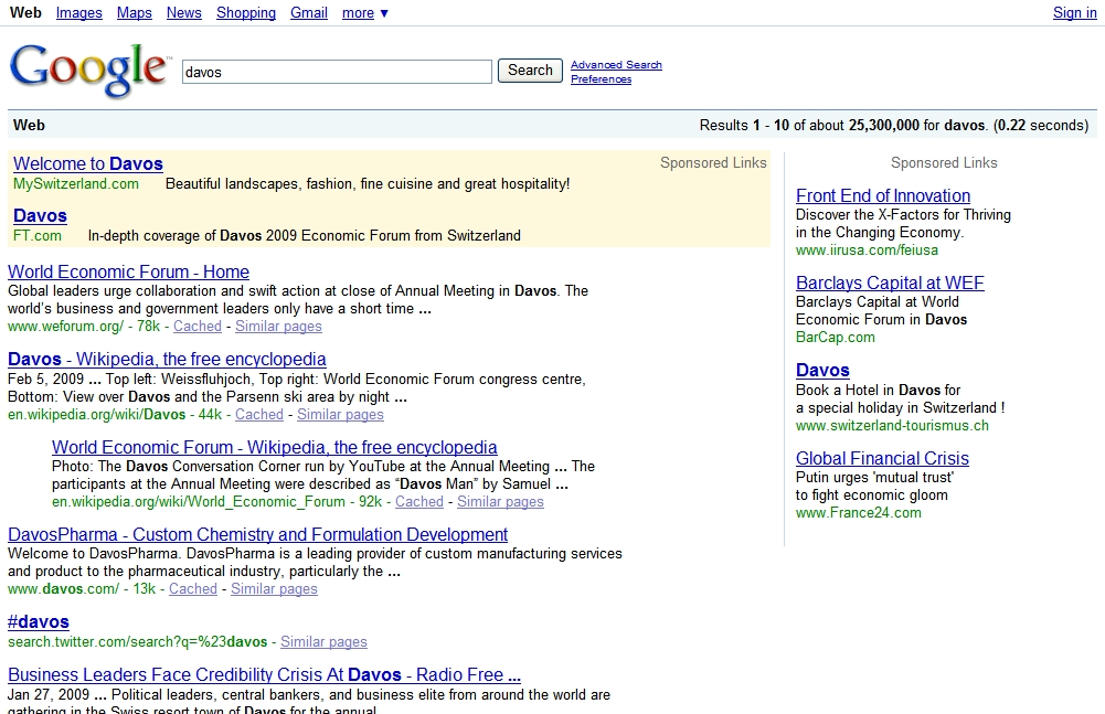
In groben Zügen ist die Farbgeschichte der Google Werbeflächen wie folgt:
Google 2000: Rosa
Google 2001-2002: Bunt (grün, blau, rosa, gelb)
Google 2004: Weiss mit den Ads nur in der rechten Spalte

Google 2005: Blau
Google 2007: Gelb

Google 2010: Rosa violett
Google 2011: Gelb
Google Heute: Weiss
Wird das die die definitiv letzte Farbänderung? Oder ist das ein Zyklus und wir werden zu Blau zurückkehren? Oder ist das nur ein Googlemechanismus um zu verhindern, dass User sich daran gewöhnen Werbung einfach zu ignorieren. Wir werden sehen was die nächste Googleüberraschung bringt!
…………………………
Last month Google made certain changes to how their sponsored advertisements were shown on the search result page. In the past the paid advertisements were shown in colour on the top and on the right side of the result page. But in the meantime, the eye of the users was just too used to just avoid the right coloured corner frame. People automatically filtered these contents out from their perception as they knew it was ads.
So in order to offer their Adwords clients more visibility they reduced the visible difference between the organic searches and the ads to only a light grey line and removed the background colour of the ads by turning it into white. Like this they avoid “Banner blindness” which as a phenomenon is well evidenced in the heat maps of Nielsen reports.
Google test teams take care of the attention economy of their users, and study the effectivity of the advertisements according to the format. So the fact that they are doing continuous changes is not by chance. Especially as the sponsored ads or Adwords section of the search site makes up a good part of the cake of its revenue according to Google’s main incomes:
Outlining the history of Google’s search results colour design:
Google 2000: Pink
Google 2001-2002: Multicolour (green, blue, pink, yellow)
Google 2004: White with ads only in right column
Google 2005: Blue
Google 2007: Yellow
Google 2010: Pink purple
Google 2011: Yellow
Google Today: White
Will this be the definitive colour change? Is it just a colour change cycle and will we come back to blue? Is it just a mechanism to avoid the ignorance of certain users after the eye got used to the usual ad locations? Let us see with what Google will surprise us!